Exploring Bokeh: A Deep Dive into Python’s Interactive Visualization Library
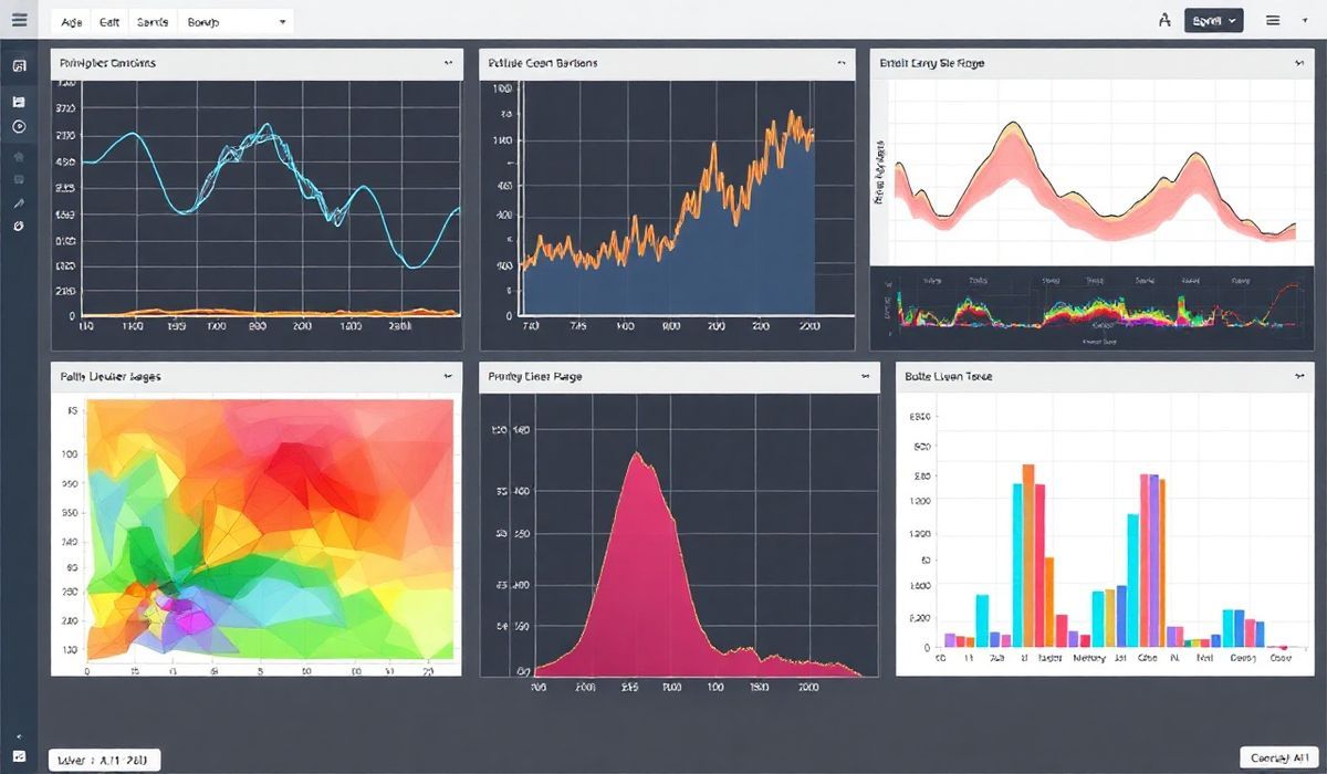
Data visualization is an essential part of modern data science workflows. Among the many libraries available, Bokeh stands out as an excellent tool for creating interactive and visually stunning visualizations with minimal effort. In this blog post, we will introduce Bokeh, explore some of its most useful APIs with working code snippets, and build a generic application to demonstrate its capabilities.
What is Bokeh?
Bokeh is an interactive visualization library for Python that enables users to create dynamic, user-friendly, and aesthetically appealing visualizations in both notebook environments and standalone web applications. Unlike static visualization tools like Matplotlib and Seaborn, Bokeh is designed to create interactive and live visualizations for web browsers.
Key Features of Bokeh:
- Create visuals ranging from basic line and bar plots to complex dashboards.
- High-performance interactivity for large or real-time datasets.
- Seamlessly integrates with tools like Pandas, NumPy, and Jupyter Notebooks.
- Easy-to-use Python interface for designing JavaScript-backed outputs.
Bokeh’s architecture consists of three main components:
- Bokeh Models: The building blocks of visualizations like glyphs, plots, and widgets.
- Bokeh Server: Allows for the development of interactive web applications.
- BokehJS: A JavaScript library that powers the visualization in web browsers.
Useful Bokeh APIs with Code Snippets
Let’s dive into APIs that Bokeh provides and what you can do with them. Below is a growing list of Bokeh APIs with examples:
1. Basic Line Plot
  from bokeh.plotting import figure, show

  # Create a basic line chart
  x = [1, 2, 3, 4, 5]
  y = [6, 7, 2, 4, 5]

  p = figure(title="Basic Line Plot", x_axis_label='X-Axis', y_axis_label='Y-Axis')
  p.line(x, y, legend_label='Line', line_width=2)

  show(p)
This creates a simple line plot with customizable axes labels and titles.
2. Circle Glyphs
  from bokeh.plotting import figure, show

  # Add circle glyphs
  p = figure(title="Circle Glyphs Example")
  p.circle(x=[1, 2, 3, 4, 5], y=[6, 7, 2, 4, 5], size=10, color="navy", alpha=0.5)

  show(p)
Circle glyphs let you add points to represent data.
3. Scatter Plot
  from bokeh.plotting import figure, show

  # Creating a scatter plot
  p = figure(title="Scatter Plot", x_axis_label='Weight', y_axis_label='Height')
  p.scatter(x=[50, 60, 65, 70, 75], y=[150, 160, 172, 180, 185], color="blue", size=15)

  show(p)
4. Bar Chart
  from bokeh.plotting import figure, show
  from bokeh.transform import dodge
  from bokeh.models import ColumnDataSource

  data = {'fruits': ['Apples', 'Bananas', 'Cherries', 'Dates'], '2022': [10, 20, 25, 15], '2023': [15, 18, 20, 25]}
  source = ColumnDataSource(data=data)

  p = figure(x_range=data['fruits'], title="Fruit Sales", x_axis_label='Fruits', y_axis_label='Sales')
  p.vbar(x=dodge('fruits', -0.2, range=p.x_range), top='2022', width=0.4, source=source, color="blue", legend_label="2022")
  p.vbar(x=dodge('fruits', 0.2, range=p.x_range), top='2023', width=0.4, source=source, color="green", legend_label="2023")

  p.legend.title = "Year"
  show(p)
Bar charts are a great way to show categorical data.
5. Hover Tool
  from bokeh.models import HoverTool

  p = figure(title="Hover Tool Example")
  p.circle([1, 2, 3, 4, 5], [5, 6, 2, 4, 7], size=10)

  hover = HoverTool()
  hover.tooltips = [("X value", "$x"), ("Y value", "$y")]

  p.add_tools(hover)
  show(p)
The HoverTool adds interactivity to visualizations by displaying information when hovering over elements.
6. Interactive Widgets Slider
  from bokeh.plotting import figure, show, curdoc
  from bokeh.models import Slider
  from bokeh.layouts import column

  # Define a plot
  plot = figure(title="Interactive Slider Example", x_range=(0, 10), y_range=(0, 10))
  line = plot.line([0, 1, 2, 3, 4], [0, 1, 4, 9, 16], line_width=2)

  # Define a slider
  slider = Slider(title="Multiplier", start=1, end=10, value=1, step=1)

  def slider_callback(attr, old, new):
      multiplier = slider.value
      line.data_source.data['y'] = [x**2 * multiplier for x in [0, 1, 2, 3, 4]]

  slider.on_change('value', slider_callback)

  layout = column(slider, plot)
  curdoc().add_root(layout)
  show(layout)
Sliders allow dynamic updates in real time.
7. Linked Panning
  from bokeh.plotting import figure, show
  from bokeh.layouts import gridplot

  # Two linked plots
  s1 = figure(title="Plot 1")
  s2 = figure(title="Plot 2", x_range=s1.x_range, y_range=s1.y_range)

  s1.scatter([1, 2, 3], [4, 5, 6], color="red")
  s2.scatter([1, 2, 3], [6, 5, 4], color="blue")

  grid = gridplot([[s1, s2]])
  show(grid)
Linked panning allows multiple plots to share the same ranges.
8. DataTable
  from bokeh.models import ColumnDataSource, DataTable, TableColumn
  from bokeh.io import show

  data = dict(name=["Alice", "Bob", "Charlie"], age=[25, 30, 35])
  source = ColumnDataSource(data)

  columns = [TableColumn(field="name", title="Name"), TableColumn(field="age", title="Age")]
  data_table = DataTable(source=source, columns=columns, width=400, height=280)

  show(data_table)
9. Adding Annotations
  from bokeh.models import Span

  p = figure(title="Annotation Example")
  p.scatter([1, 2, 3, 4], [4, 3, 2, 1])
  vline = Span(location=2.5, dimension='height', line_color='green', line_width=2)
  p.add_layout(vline)

  show(p)
10. Heatmap
  import numpy as np
  from bokeh.models import LinearColorMapper
  from bokeh.plotting import figure, show

  data = np.random.rand(10, 10)

  p = figure(title="Heatmap Example")
  color_mapper = LinearColorMapper(palette='Viridis256', low=data.min(), high=data.max())
  p.image(image=[data], x=0, y=0, dw=10, dh=10, color_mapper=color_mapper)

  show(p)
11. Datetime Axes
  from datetime import datetime
  from bokeh.plotting import figure, show

  dates = [datetime(2023, 10, 1), datetime(2023, 10, 2), datetime(2023, 10, 3)]
  values = [100, 200, 250]

  p = figure(x_axis_type='datetime', title="Datetime Example")
  p.line(dates, values)

  show(p)
Building a Generic Bokeh Application
Using the above APIs, let’s create a simple interactive application that combines multiple features of Bokeh.
  from bokeh.plotting import figure, curdoc
  from bokeh.models import Slider, Dropdown
  from bokeh.layouts import column, row
  import numpy as np

  # Create a scatter plot
  plot = figure(title="Interactive Scatter Plot with Dropdown and Slider", x_axis_label="X-Axis", y_axis_label="Y-Axis", tools="hover")
  x = np.random.random(100)
  y = x + np.random.random(100) * 0.5
  scatter = plot.scatter(x, y, size=10)

  # Dropdown menu
  dropdown = Dropdown(label="Select Color", menu=[("Blue", "blue"), ("Green", "green"), ("Red", "red")])
  def dropdown_callback(event):
      scatter.glyph.fill_color = event.item
  dropdown.on_change("value", dropdown_callback)

  # Slider to change point size
  slider = Slider(start=5, end=20, value=10, step=1, title="Point Size")
  def slider_callback(attr, old, new):
      scatter.glyph.size = slider.value
  slider.on_change("value", slider_callback)

  # Layout and application
  layout = column(dropdown, slider, plot)
  curdoc().add_root(layout)
This blog post laid out an introduction to Bokeh, its essential APIs, and a practical application. Start creating interactive visualizations using Bokeh today!


