Introduction to Matplotlib Inline
Matplotlib Inline is a backend for Jupyter notebooks that allows the inline display of plots. This feature is extremely useful for data analysis and visualization directly within Jupyter notebooks. By using Matplotlib Inline, you can observe the graphical representation of data without the need to open a separate window for each plot.
Getting Started with Matplotlib Inline
To enable Matplotlib Inline, you simply use the following command:
  ```
  %matplotlib inline
  ```
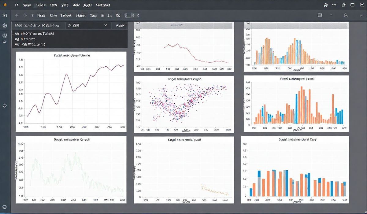
Creating Basic Plots
Here are a few examples demonstrating basic plotting using Matplotlib Inline:
Line Plot
  ```
  import matplotlib.pyplot as plt
  import numpy as np

  x = np.linspace(0, 10, 100)
  y = np.sin(x)

  plt.figure()
  plt.plot(x, y, label="Sine Wave")
  plt.xlabel("X-axis")
  plt.ylabel("Y-axis")
  plt.title("Simple Line Plot")
  plt.legend()
  plt.show()
  ```
Scatter Plot
  ```
  x = np.random.rand(50)
  y = np.random.rand(50)
  colors = np.random.rand(50)
  area = (30 * np.random.rand(50))**2

  plt.scatter(x, y, s=area, c=colors, alpha=0.5)
  plt.title("Scatter Plot with Varying Markers")
  plt.show()
  ```
Bar Plot
  ```
  categories = ['Apple', 'Banana', 'Orange', 'Grapes']
  values = [24, 18, 30, 22]

  plt.bar(categories, values)
  plt.xlabel("Fruits")
  plt.ylabel("Quantity")
  plt.title("Bar Chart")
  plt.show()
  ```
Advanced Plot Customizations
Let’s take a look at adding some advanced customizations:
Subplots
  ```
  fig, axs = plt.subplots(2, 2, figsize=(10, 10))

  x = np.linspace(0, 10, 100)

  axs[0, 0].plot(x, np.sin(x))
  axs[0, 0].set_title("Sine")

  axs[0, 1].plot(x, np.cos(x))
  axs[0, 1].set_title("Cosine")

  axs[1, 0].plot(x, np.tan(x))
  axs[1, 0].set_title("Tangent")

  axs[1, 1].plot(x, -np.sin(x))
  axs[1, 1].set_title("Negative Sine")

  fig.tight_layout()
  plt.show()
  ```
Interactive Application Example
To illustrate how powerful and interactive Matplotlib Inline can be, let’s build a simple application for real-time data visualization:
  ```
  import numpy as np
  import matplotlib.pyplot as plt
  from matplotlib.animation import FuncAnimation

  x_data = []
  y_data = []

  fig, ax = plt.subplots()
  line, = ax.plot(0, 0)

  ax.set_xlim(0, 10)
  ax.set_ylim(0, 10)

  def update(frame):
      x_data.append(frame)
      y_data.append(np.sin(frame))
      line.set_data(x_data, y_data)
      ax.relim()
      ax.autoscale_view()
      return line,

  ani = FuncAnimation(fig, update, frames=np.linspace(0, 10, 100), blit=True)
  plt.show()
  ```
With the above example, you can see how to create interactive plots that change over time, which is very handy for visualizing real-time data changes directly within your Jupyter notebook.
Hash: e6b04f119a37a5c00de675ab2a1cf91c646379020076f692b4c90695d9211094