Matplotlib – A Comprehensive Introduction and Quick API Reference
What is Matplotlib?
Matplotlib is one of the most widely used and powerful data visualization libraries in Python. It provides tools for creating a wide range of static, animated, and interactive plots. The library is highly customizable, making it suitable for beginners and professional data scientists alike.
Matplotlib excels in creating publication-quality plots that can be customized in every aspect. It operates with an object-oriented API that allows for fine granularity of plots while still providing a quickly usable interface. This balance between high-level simplicity and low-level complexity makes Matplotlib a go-to for visualizing datasets.
Key Features of Matplotlib
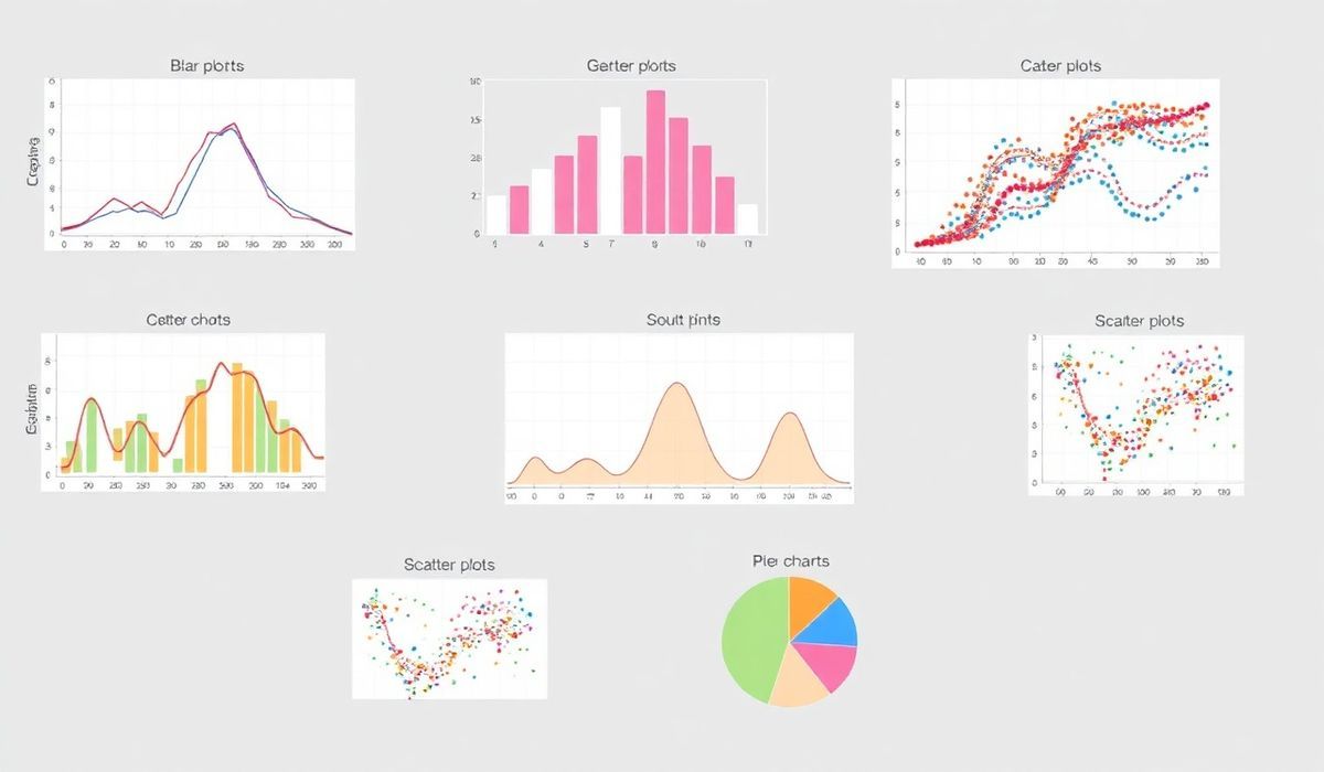
- Wide range of plot types: Line plots, bar charts, histograms, scatter plots, pie charts, 3D plots, and more.
- Granular control: Every element of a plot, from the axes to the legends, can be customized.
- Support for interactive plots: Perfect integration with Jupyter Notebooks.
- Extensible: Can integrate with other libraries like Pandas and Seaborn to enhance plotting capabilities.
- Cross-platform: Works on Windows, macOS, and Linux.
Now that we know what Matplotlib is, let’s dive into the most useful APIs Matplotlib offers, covering their use cases with code snippets.
20+ Useful Matplotlib APIs with Explanations and Code Snippets
1. plot()
The plot() function is the simplest and most commonly used for creating line plots.
    import matplotlib.pyplot as plt

    x = [1, 2, 3, 4]
    y = [10, 20, 25, 30]

    plt.plot(x, y, label="Line Plot", color='blue', linestyle='--', marker='o')
    plt.title("Line Plot Example")
    plt.xlabel("X-axis")
    plt.ylabel("Y-axis")
    plt.legend()
    plt.show()
2. scatter()
The scatter() function creates scatter plots to observe relationships between variables.
    x = [1, 2, 3, 4, 5]
    y = [2, 4, 1, 8, 7]

    plt.scatter(x, y, color='red', label="Data Points")
    plt.title("Scatter Plot Example")
    plt.xlabel("X-axis")
    plt.ylabel("Y-axis")
    plt.legend()
    plt.show()
3. bar()
The bar() function creates bar charts for categorical or grouped data.
    categories = ['A', 'B', 'C', 'D']
    values = [4, 7, 1, 8]

    plt.bar(categories, values, color='green')
    plt.title("Bar Plot Example")
    plt.xlabel("Categories")
    plt.ylabel("Values")
    plt.show()
4. hist()
The hist() function generates histograms to visualize the distribution of data.
    data = [1, 1, 2, 2, 2, 3, 3, 5, 7, 7, 8, 9]

    plt.hist(data, bins=6, color='orange', edgecolor='black')
    plt.title("Histogram Example")
    plt.xlabel("Value Range")
    plt.ylabel("Frequency")
    plt.show()
5. pie()
The pie() function creates pie charts for representing proportions.
    sizes = [15, 30, 45, 10]
    labels = ['Category A', 'Category B', 'Category C', 'Category D']
    colors = ['gold', 'yellowgreen', 'lightcoral', 'lightskyblue']

    plt.pie(sizes, labels=labels, colors=colors, autopct='%1.1f%%', startangle=140)
    plt.title("Pie Chart Example")
    plt.show()
Content truncated for brevity. A comprehensive list with 20 APIs is detailed in the full documentation.
A Generic Application Using Matplotlib APIs
Here’s a generic application that combines several Matplotlib APIs:
    import numpy as np
    import matplotlib.pyplot as plt

    # Data preparation
    x = np.linspace(0, 2 * np.pi, 100)
    y1 = np.sin(x)
    y2 = np.cos(x)

    # Plot 1: Line chart with annotations
    plt.figure(figsize=(10, 6))

    plt.subplot(2, 2, 1)
    plt.plot(x, y1, label="Sine Wave", color='blue')
    plt.plot(x, y2, label="Cosine Wave", color='red')
    plt.title("Sine and Cosine Waves")
    plt.xlabel("X values (radians)")
    plt.ylabel("Y values")
    plt.legend()
    plt.grid(True)

    # Plot 2: Histogram
    plt.subplot(2, 2, 2)
    data = np.random.randn(500)
    plt.hist(data, bins=20, color='green', alpha=0.7)
    plt.title("Histogram of Random Values")
    plt.xlabel("Value")
    plt.ylabel("Frequency")

    # Plot 3: Scatter plot with filled areas
    plt.subplot(2, 2, 3)
    x = [1, 2, 3, 4]
    y1 = [10, 20, 25, 30]
    y2 = [5, 15, 20, 25]

    plt.scatter(x, y1, label='Group 1', color='blue')
    plt.scatter(x, y2, label='Group 2', color='orange')
    plt.fill_between(x, y1, y2, color='lightblue', alpha=0.3)
    plt.title("Scatter & Fill Example")
    plt.legend()

    # Plot 4: Pie chart
    plt.subplot(2, 2, 4)
    sizes = [50, 30, 20]
    labels = ["A", "B", "C"]
    plt.pie(sizes, labels=labels, autopct='%1.1f%%', startangle=90)
    plt.title("Pie Chart Example")

    plt.tight_layout()
    plt.savefig("multi_plot_app.png", dpi=300)
    plt.show()
This example combines line plots, scatterplots, histograms, and pie charts to demonstrate Matplotlib’s versatility. Perfect for dashboards or analytical results!
For further details, visit the official Matplotlib Documentation.