Seaborn: A Comprehensive Guide
If you’re diving into the world of data visualization in Python, you’ve probably come across Seaborn. It’s one of the most popular data visualization libraries that makes creating high-quality and aesthetic charts exceptionally easy. Built on top of Matplotlib, Seaborn provides a high-level interface for creating visually appealing and informative statistical plots. Whether you’re working on descriptive analytics, advanced data exploration, or machine learning tasks, understanding and mastering Seaborn is key to presenting your data effectively.
What is Seaborn?
Seaborn is an open-source Python data visualization library based on Matplotlib. It was specifically designed to work seamlessly with pandas and NumPy data structures, making it the perfect choice for data exploration and storytelling. From simple scatter plots to complex multivariable visualizations, Seaborn simplifies the process of creating stunning and insightful graphics.
Key Features of Seaborn
- Works well with datasets: Seaborn works naturally with pandas DataFrame objects and supports NumPy arrays.
- Statistical functionality: Many built-in statistical tools such as regression plotting and confidence intervals are included.
- Automatic themes: Default themes allow for visually appealing charts straight out of the box.
- Supports multiple plot styles: Seaborn comes with multiple aesthetics to suit your data storytelling.
- Integration with Matplotlib: Offers flexibility to extend Seaborn plots with Matplotlib customization.
Seaborn API Reference: 50+ Key Functions and Code Snippets
Here’s an extensive reference to the diverse options available in Seaborn, with easy-to-follow snippets:
1. set_style(): Control the style of plots.
  import seaborn as sns
  sns.set_style("whitegrid")  # Other options: "darkgrid", "white", "dark", "ticks"
2. set_context(): Customize the scaling of plot elements.
sns.set_context("talk") # Other options: "paper", "notebook", "poster"
3. color_palette(): Set color palettes for plots.
sns.set_palette("husl") # Other options: "pastel", "muted", "deep"
4. load_dataset(): Load example datasets provided by Seaborn.
tips = sns.load_dataset("tips") # Datasets: "iris", "flights", "penguins", etc.
5. relplot(): Create scatter and line plots.
sns.relplot(data=tips, x="total_bill", y="tip", hue="time", style="sex")
6. scatterplot(): Display a scatter plot.
sns.scatterplot(data=tips, x="total_bill", y="tip", hue="day", size="size")
7. lineplot(): Plot a line graph.
sns.lineplot(data=tips, x="total_bill", y="tip", hue="time")
8. histplot(): Create a histogram.
sns.histplot(data=tips, x="total_bill", bins=20, kde=True)
9. kdeplot(): Kernel Density Estimation plot for distribution visualization.
sns.kdeplot(data=tips, x="total_bill", shade=True)
10. boxplot(): Create a box plot to show distributions.
sns.boxplot(data=tips, x="day", y="tip", hue="sex")
11. violinplot(): Visualize distributions with both box and KDE plots.
sns.violinplot(data=tips, x="day", y="tip", hue="sex", split=True)
12. stripplot(): Add scatter points to categorical plots.
sns.stripplot(data=tips, x="day", y="tip", hue="sex", jitter=True)
13. swarmplot(): Non-overlapping scatter points on a category plot.
sns.swarmplot(data=tips, x="day", y="tip", hue="sex")
14. barplot(): Create a bar chart.
sns.barplot(data=tips, x="day", y="tip", hue="sex")
15. pointplot(): Visualize point estimates.
sns.pointplot(data=tips, x="time", y="tip", hue="smoker")
16. pairplot(): Visualize pairwise relationships in the dataset.
sns.pairplot(data=tips, hue="sex")
17. jointplot(): Create a joint scatter and distribution plot.
sns.jointplot(data=tips, x="total_bill", y="tip", kind="reg")
18. heatmap(): Create a heatmap for correlation matrices.
  import numpy as np
  corr = tips.corr()
  sns.heatmap(corr, annot=True, cmap="coolwarm")
19. clustermap(): Cluster and plot similarities across data points.
sns.clustermap(corr, cmap="coolwarm")
20. FacetGrid(): Multi-plot grid for subsetting data.
  g = sns.FacetGrid(data=tips, col="sex", row="time")
  g.map(sns.scatterplot, "total_bill", "tip")
21. lmplot(): Linear regression plot.
sns.lmplot(data=tips, x="total_bill", y="tip", hue="sex")
22. regplot(): Show regression with confidence intervals specifically.
sns.regplot(data=tips, x="total_bill", y="tip", scatter_kws={"color": "blue"})
23. residplot(): Show residuals from a linear regression.
sns.residplot(data=tips, x="total_bill", y="tip")
24. rugplot(): Add marginal ticks.
sns.rugplot(data=tips, x="total_bill")
25. catplot(): Categorical plot builder (i.e., box, strip, point in one function).
sns.catplot(data=tips, x="day", y="tip", kind="violin", hue="smoker")
26. despine(): Remove spline borders from plots.
  sns.boxplot(data=tips, x="day", y="tip")
  sns.despine()
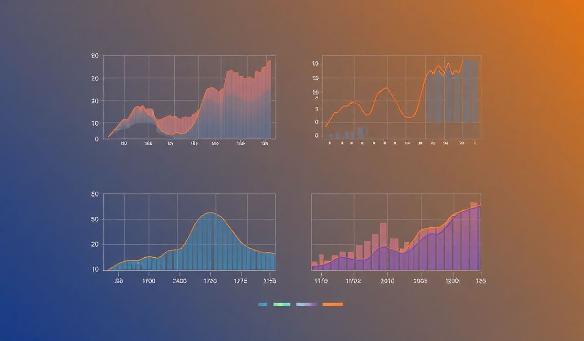
A Real-World Application with Seaborn
Let’s showcase a generic data visualization application using Seaborn:
Problem: Visualize the restaurant `tips` dataset to uncover insights.
  import seaborn as sns
  import matplotlib.pyplot as plt

  # Load Dataset
  tips = sns.load_dataset("tips")

  # Set Theme
  sns.set_style("whitegrid")

  # Visualize total bills vs. tips
  plt.figure(figsize=(10, 6))
  sns.scatterplot(data=tips, x="total_bill", y="tip", hue="time", style="sex")
  plt.title("Scatter plot of Total Bill vs. Tip")
  plt.show()

  # Show distribution of tips on each day
  plt.figure(figsize=(10, 6))
  sns.boxplot(data=tips, x="day", y="tip", palette="coolwarm", hue="sex")
  plt.title("Boxplot of Tips by Day")
  plt.show()

  # Heatmap of Correlation between numerical variables
  plt.figure(figsize=(8, 5))
  corr_matrix = tips.corr()
  sns.heatmap(corr_matrix, annot=True, cmap="coolwarm", fmt=".2f")
  plt.title("Correlation Heatmap of Features")
  plt.show()
Output:
- Scatter plot highlights differences between meals (Lunch vs. Dinner).
- Boxplots indicate tip trends across days and gender.
- The heatmap reveals correlations (e.g., a strong relationship between total bill and tip size).
Final Thoughts
Seaborn is indispensable for Python developers and data scientists who aim to up their data visualization game. With its clean integration into the Python ecosystem and statistical insight, it streamlines everything from simple plots to sophisticated visualizations. Use the above APIs and examples as your go-to for creating stunning, informative visuals effortlessly!