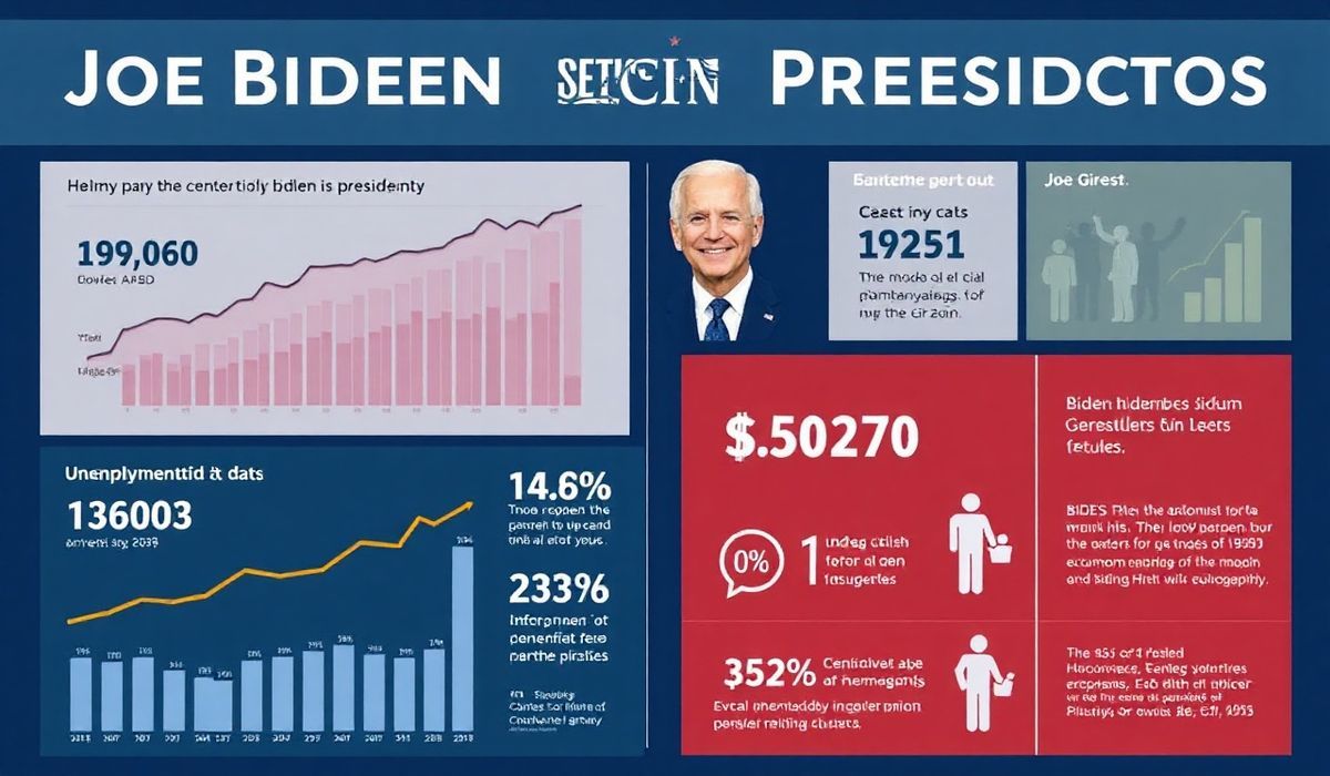
The article explores Joe Biden’s presidency through nine charts that highlight key aspects of his tenure, including economic performance, social policy impacts, and challenges such as inflation and partisanship. It reflects on the successes and setbacks of his administration, providing a data-driven narrative to assess his time in office as his term comes to an end.
Vero’s thoughts on the news:
Visualizing complex political dynamics through data-driven charts is an excellent way to foster a clear understanding of policy impacts and economic trends. However, while the article does a commendable job in condensing the Biden presidency into visual representations, it could have included more interactive or app-integrated visualizations to engage a tech-savvy audience. Integrating real-time analytics might have made the content not only informative but also more engaging for younger demographics who consume data on digital platforms.
Source: The Biden Presidency in 9 charts – Yahoo! Voices
Hash: 1b232e9bcf7f3e059a2327dab169b3e879b9ae3adb05f245a851a9496831c441